<- See Stata 18's new features
Highlights
Create a "Table 1" style table with the following:
Summary statistics for continuous and categorical variables
Summary statistics for groups of your data
Test statistics comparing groups on summary statistics
Survey-adjusted test statistics
Survey-weighted statistics
Customize the table
Add a title with a customized font style
Add notes with a customized font style
Customize sample statistics, format, column header, and more
Export the table
Word®
Excel®
HTML
LaTeX
And more
See more reporting features
Easily create your Table 1 with the new dtable command. Report descriptive statistics. Compare statistics across groups. Export to Word, Excel, PDF, HTML, and more.
When you publish your work, it is typical to include a table of descriptive statistics, commonly known as a "Table 1"; this provides your reader with some information about your sample. For example, you may want to present some demographics, such as average age and average income. You might also compare these characteristics across groups, such as regions or fields of occupation.
In Stata 18, you can use dtable to create these and many other variations of a "Table 1" and export them to many formats. For instance, we can create a table and export it to Excel:
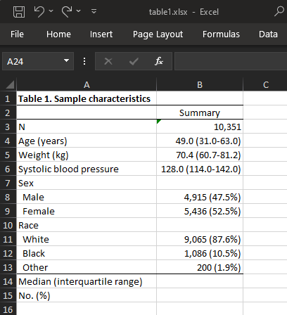
Table 1–Excel
Or we can create a table and export to HTML,
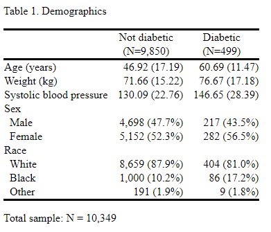
Table 1–HTML
Word,
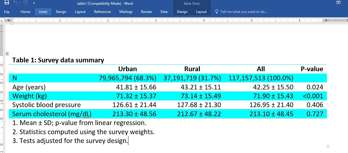
Table 1–Word
or PDF.
Table 1–PDF
Also, because dtable is built on the collect suite of commands, which is designed for customizing any type of table, you can use the collect commands to further customize the look of your tables after you have created them using dtable.
-> A simple example
-> Defining your own statistics
-> Further customization using collect
With dtable, creating a table of descriptive statistics can be as easy as specifying the variables you want in your table. dtable is designed so that you can create and export a table to various formats in one step. Means and standard deviations will be reported for continuous variables, and counts and percentages will be reported for factor variables. If this is all you need, you'll simply specify the filename and file format to which you want to export, and you'll be done. But of course, you can customize the table by including a range of statistics, performing different tests to check for equality between groups, adding a title and notes, and making other modifications.
In the examples below, we discuss how to create, modify, and export tables of descriptive statistics.
To get started, we load data from the Second National Health and Nutrition Examination Survey (NHANES II) (McDowell et al. 1981). We want summary statistics for the variables specified but separately for each category of diabetes. Note that we use factor-variable notation to indicate that sex and race are categorical variables. And we export the table to the file table1.html:
. webuse nhanes2l, clear
(Second National Health and Nutrition Examination Survey)

. dtable age weight bpsystol i.sex i.race, by(diabetes) export(table1.html, replace)
| Diabetes status |
| Not diabetic Diabetic Total |
| N 9,850 (95.2%) 499 (4.8%) 10,349 (100.0%) |
| Age (years) 46.918 (17.193) 60.687 (11.475) 47.582 (17.216) |
| Weight (kg) 71.658 (15.220) 76.670 (17.175) 71.900 (15.357) |
| Systolic blood pressure 130.088 (22.759) 146.651 (28.387) 130.887 (23.332) |
| Sex |
| Male 4,698 (47.7%) 217 (43.5%) 4,915 (47.5%) |
| Female 5,152 (52.3%) 282 (56.5%) 5,434 (52.5%) |
| Race |
| White 8,659 (87.9%) 404 (81.0%) 9,063 (87.6%) |
| Black 1,000 (10.2%) 86 (17.2%) 1,086 (10.5%) |
| Other 191 (1.9%) 9 (1.8%) 200 (1.9%) |
This is how easy it can be to create and export a table. If you prefer to export this table to another format, such as LaTeX or PDF, just specify the appropriate file extension. While this is an informative table, we will further customize it below.
By default, dtable reports means and standard deviations for continuous variables and counts and percentages for factor variables. We can see that roughly 95% of our sample is not diabetic while 5% is. We also see that the average systolic blood pressure for the nondiabetic group is 130 and the average for the diabetic group is 147. We can test whether mean systolic blood pressure differs across diabetic status. We can also test whether sex and diabetic status are independent. We could report tests comparing all variables across diabetic status groups. However, we're not interested in comparing the age or racial composition for the two groups, so we suppress these tests for age and race. We also suppress the descriptive statistics for the overall sample, the column labeled "Total":
. dtable age weight bpsystol i.sex i.race, by(diabetes, nototals tests)
continuous(age, test(none)) factor(race, test(none))
note: using test regress across levels of diabetes for weight and bpsystol.
note: using test pearson across levels of diabetes for sex.
| Diabetes status |
| Not diabetic Diabetic Test |
| N 9,850 (95.2%) 499 (4.8%) |
| Age (years) 46.918 (17.193) 60.687 (11.475) |
| Weight (kg) 71.658 (15.220) 76.670 (17.175) <0.001 |
| Systolic blood pressure 130.088 (22.759) 146.651 (28.387) <0.001 |
| Sex |
| Male 4,698 (47.7%) 217 (43.5%) 0.066 |
| Female 5,152 (52.3%) 282 (56.5%) |
| Race |
| White 8,659 (87.9%) 404 (81.0%) |
| Black 1,000 (10.2%) 86 (17.2%) |
| Other 191 (1.9%) 9 (1.8%) |
Next we specify the suboption place(seplabels) to place the frequency for each subsample in the column label but on a separate row. By default, frequencies and percentages are both reported for each group, but we want only the frequencies. Furthermore, we can modify how our statistics are displayed by using the sformat() option; here we enclose the counts in parentheses. We'll also add a note with the total sample size and hide the label for the by() variable from the column header.
. dtable age weight bpsystol i.sex i.race, by(diabetes, nototals tests)
continuous(age, test(none)) factor(race, test(none))
sample(, statistics(freq) place(seplabels)) sformat("(N=%s)" frequency)
note(Total sample: N = 10,349)  column(by(hide))
note: using test regress across levels of diabetes for weight and bpsystol.
note: using test pearson across levels of diabetes for sex.
| Not diabetic Diabetic Test |
| (N=9,850) (N=499) |
| Age (years) 46.918 (17.193) 60.687 (11.475) |
| Weight (kg) 71.658 (15.220) 76.670 (17.175) <0.001 |
| Systolic blood pressure 130.088 (22.759) 146.651 (28.387) <0.001 |
| Sex |
| Male 4,698 (47.7%) 217 (43.5%) 0.066 |
| Female 5,152 (52.3%) 282 (56.5%) |
| Race |
| White 8,659 (87.9%) 404 (81.0%) |
| Black 1,000 (10.2%) 86 (17.2%) |
| Other 191 (1.9%) 9 (1.8%) |
Finally, we format the means and standard deviations to two decimal places, add a title, and export our final table to an HTML file:
. dtable age weight bpsystol i.sex i.race, by(diabetes, nototals tests)
continuous(age, test(none)) factor(race, test(none))
sample(, statistics(freq) place(seplabels)) sformat("(N=%s)" frequency)
note(Total sample: N = 10,349) column(by(hide))
nformat(%7.2f mean sd) title(Table 1. Demographics) export(table1.html, replace)
note: using test regress across levels of diabetes for weight and bpsystol.
note: using test pearson across levels of diabetes for sex.

Table 1. Demographics
| Not diabetic Diabetic Test |
| (N=9,850) (N=499) |
| Age (years) 46.92 (17.19) 60.69 (11.47) |
| Weight (kg) 71.66 (15.22) 76.67 (17.18) <0.001 |
| Systolic blood pressure 130.09 (22.76) 146.65 (28.39) <0.001 |
| Sex |
| Male 4,698 (47.7%) 217 (43.5%) 0.066 |
| Female 5,152 (52.3%) 282 (56.5%) |
| Race |
| White 8,659 (87.9%) 404 (81.0%) |
| Black 1,000 (10.2%) 86 (17.2%) |
| Other 191 (1.9%) 9 (1.8%) |
dtable offers a wide range of statistics that you can include in your table, such as the coefficient of variation, geometric mean, skewness, and many more. However, you may want to combine statistics in one cell. For example, you might place the interquartile range right beside the median. With dtable, you can create composite results from any of the supported statistics.
Below, we want to compare some health-related measurements across individuals who have had a heart attack with those who haven't. We want means and standard deviations in one cell, separated by the plus-minus sign. Additionally, we want the interquartile range placed right next to the median. We define each of these composite results and specify the delimiter. Then we specify the statistics we want for each variable. Also, we add the svy option so that the statistics will be computed using survey weights.
. dtable, by(heartatk, tests) svy
        define(meansd = mean sd, delimiter(" ± "))
        define(myiqr = p25 p75, delimiter("-"))
        continuous(age, stat(meansd) test(none))
        continuous(bmi, stat(meansd))
        continuous(bpsystol tcresult, stat(median myiqr))
note: using test regress across levels of heartatk for bmi, bpsystol, and tcresult.
| Prior heart attack |
| No heart attack Had heart attack Total Test |
| N 113,647,835 (97.0%) 3,483,276 (3.0%) 117,131,111 (100.0%) |
| Age (years) 41.695 ± (15.320) 60.491 ± (9.054) 42.254 ± (15.504) |
| Body mass index (BMI) 25.235 ± (4.787) 26.604 ± (5.146) 25.276 ± (4.803) <0.001 |
| Systolic blood pressure 122.000 110.000-138.000 138.000 122.000-150.000 124.000 110.000-140.000 <0.001 |
| Serum cholesterol (mg/dL) 207.000 179.000-241.000 231.000 202.000-267.000 208.000 179.000-242.000 <0.001 |
Next we'll format the percentiles and the medians to zero decimal places, and we'll place the interquartile range in parentheses. By default, standard deviations are placed in parentheses, but we remove the parentheses below:
. dtable, by(heartatk, tests) svy
        define(meansd = mean sd, delimiter(" ± "))
        define(myiqr = p25 p75, delimiter("-"))
        continuous(age, stat(meansd) test(none))
        continuous(bmi, stat(meansd))
        continuous(bpsystol tcresult, stat(median myiqr))
        nformat(%6.0f p25 p75 median) sformat("(%s)" myiqr)
        nformat(%6.1f mean sd) sformat("%s" sd)
note: using test regress across levels of heartatk for bmi, bpsystol, and tcresult.
| Prior heart attack |
| No heart attack Had heart attack Total Test |
| N 113,647,835 (97.0%) 3,483,276 (3.0%) 117,131,111 (100.0%) |
| Age (years) 41.7 ± 15.3 60.5 ± 9.1 42.3 ± 15.5 |
| Body mass index (BMI) 25.2 ± 4.8 26.6 ± 5.1 25.3 ± 4.8 <0.001 |
| Systolic blood pressure 122 (110-138) 138 (122-150) 124 (110-140) <0.001 |
| Serum cholesterol (mg/dL) 207 (179-241) 231 (202-267) 208 (179-242) <0.001 |
Finally, we remove the label for the by() variable, change the label for the "Total" column, and change the label for the p-values:
. dtable, by(heartatk, tests) svy
        define(meansd = mean sd, delimiter(" ± "))
        define(myiqr = p25 p75, delimiter("-"))
        continuous(age, stat(meansd) test(none))
        continuous(bmi, stat(meansd))
        continuous(bpsystol tcresult, stat(median myiqr))
        nformat(%6.0f p25 p75 median) sformat("(%s)" myiqr)
        nformat(%6.1f mean sd) sformat("%s" sd)
        column(by(hide) total(All) test(P-value))
note: using test regress across levels of heartatk for bmi, bpsystol, and tcresult.
| No heart attack Had heart attack All P-value |
| N 113,647,835 (97.0%) 3,483,276 (3.0%) 117,131,111 (100.0%) |
| Age (years) 41.7 ± 15.3 60.5 ± 9.1 42.3 ± 15.5 |
| Body mass index (BMI) 25.2 ± 4.8 26.6 ± 5.1 25.3 ± 4.8 <0.001 |
| Systolic blood pressure 122 (110-138) 138 (122-150) 124 (110-140) <0.001 |
| Serum cholesterol (mg/dL) 207 (179-241) 231 (202-267) 208 (179-242) <0.001 |
While dtable is designed to create and export a table in one step, you can customize these tables further with the collect suite of commands. Below, we change the color of the borders and the background color for alternating rows in our table:
. collect style cell border_block[column-header corner],
border(top, color(cyan))
. * Change the border color above the corner and column headers to cyan

. collect style cell border_block[row-header item],
border(bottom, color(cyan))
border(top, color(cyan))
. * Change the border color above and below the results and row headers to cyan

. collect style cell cell_type[column-header], font(, bold)
. * Make the column headers bold

. collect style cell var[_N bmi tcresult], shading(background(cyan))
. /*
Change the background color to cyan for the rows corresponding to N,
BMI, and cholesterol
*/
Finally, we specify that the width of the columns be resized to fit the table contents and export the table:
. collect style putdocx, layout(autofitcontents)

. collect export table2.docx, replace
(collection DTable exported to file table2.docx)
Here is our resulting document:
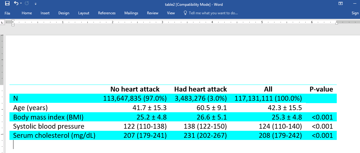
Table 2–Word
See [R] dtable for more examples of how you can create tables of descriptive statistics.
McDowell, A., A. Engel, J. T. Massey, and K. Maurer. 1981. Plan and operation of the Second National Health and Nutrition Examination Survey, 1976–1980. Vital and Health Statistics 1: 1144.
Read more about how to create and export tables of descriptive statistics in the Stata Base Reference Manual; see [R] dtable.
View all the new features in Stata 18.


