1 item has been added to your cart.
| Title | Frequency plots | |
| Author | Jeremy B. Wernow, StataCorp |
Frequency plots can be made in Stata using the hist command with the freq option.
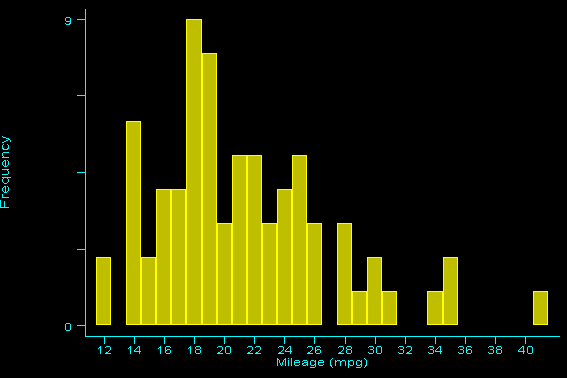
. hist mpg, freq
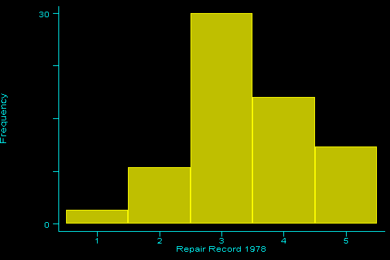
. hist rep78, freq
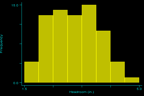
However, if the variable you are graphing takes on noninteger values, this command will not work.
  . describe headroom

                storage  display     value
  variable name   type   format      label      variable label
  ------------------------------------------------------------------------
  headroom        float  %6.1f                  Headroom (in.)

  . tab headroom

     Headroom |
        (in.) |      Freq.     Percent        Cum.
  ------------+-----------------------------------
          1.5 |          4        5.41        5.41
          2.0 |         13       17.57       22.97
          2.5 |         14       18.92       41.89
          3.0 |         13       17.57       59.46
          3.5 |         15       20.27       79.73
          4.0 |         10       13.51       93.24
          4.5 |          4        5.41       98.65
          5.0 |          1        1.35      100.00
  ------------+-----------------------------------
        Total |         74      100.00

  . hist headroom, freq
  headroom must take on integer values
  r(198);
An alternate solution would be to create a group variable, and then use the graph command with the freq, hist, and bin() options.
  . egen y = group(headroom)

  . list y headroom in 1/10

               y  head~m
    1.         3     2.5
    2.         4     3.0
    3.         4     3.0
    4.         7     4.5
    5.         6     4.0
    6.         6     4.0
    7.         4     3.0
    8.         2     2.0
    9.         5     3.5
   10.         5     3.5

  . summarize y

      Variable |     Obs        Mean   Std. Dev.       Min        Max
  -------------+-----------------------------------------------------
             y |      74    3.986486    1.69199          1          8

  . local x = r(max) - r(min) + 1

  . graph headroom, freq hist bin(`x')
The difference between the minimum and maximum values of the new group variable will provide the value needed for the bin option. The minimum and maximum values are obtained by first summarizing the group variable and then putting the saved results into a local macro. Typing this macro every time could become very tedious. An easier solution would be to create an ado-file. Here is a general example of such a file:
        -----------------------------------------freqplot.ado
        program define freqplot
        	version 7.0
        	syntax varlist(max=1)
        	tempvar y
        	qui egen `y' = group(`varlist')
        	qui sum `y'
        	local x = int(r(max)) - int(r(min)) + 1
        	graph `varlist', histogram freq bin(`x')
        end
        -----------------------------------------freqplot.ado
Note: If you save this file using your browser, save it as a .txt file and put double quotes around the name; i.e., enter the filename:
"freqplot.ado"
Be sure you include the double quotes so that the file will not be saved as freqplot.ado.txt.
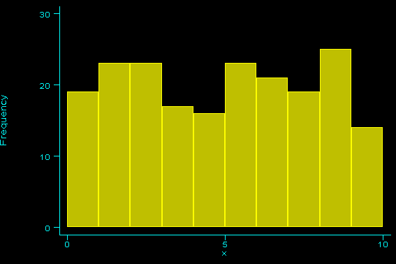
Suppose you wish to graph a continuous variable as opposed to a categorical variable. In this case, there is no obvious choice for the number of bins to use. If the range of the variable is relatively small, you might try the following method:
  . set obs 200
  obs was 0, now 200

  . gen x = uniform()*10

  . summarize x

      Variable |     Obs        Mean   Std. Dev.       Min        Max
  -------------+-----------------------------------------------------
             x |     200    4.920775   2.874816   .0572334   9.844069

  . local y = int(r(max)+1) - int(r(min))

  . graph x, freq hist bin(`y') xlabel ylabel
Suppose, however, that the range is much larger. The simple way to approach this problem is to just declare the bin size manually.
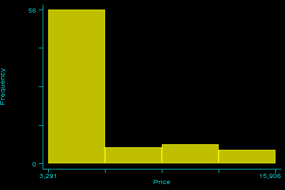
. graph price, freq hist bin(4)