

In the spotlight: Formatting Excel® tables from within Stata
New capabilities of putexcel in Stata 14 let you format cells and fonts in Excel. This means that you can now easily export matrices, expressions, and stored results from Stata to Excel and control how they appear. You can also insert Stata graphs and add cell formulas. Now it’s easy to format the cells to create custom tables or reports. Let’s see how it’s done.
| Variable | Description |
|---|---|
| prate | participation rate |
| mrate | plan match rate, per $ |
| sole | =1 if only retirement plan |
Suppose I am estimating a fractional-response model for 401(k) participation and want to create a table of my results that I could include in a presentation or publication. A short description of the variables is shown to the right.
. webuse 401k
. fracreg probit prate mrate sole
  (output omitted)
After I fit my model, I want to write out the estimated coefficients and standard errors to Excel. Most estimation commands in Stata store results in the r(table) matrix, giving you an easy way to access estimated coefficients, standard errors, test statistics, and the like from a single stored result. All you need to do is extract the appropriate rows and columns from the matrix.
I do this by typing
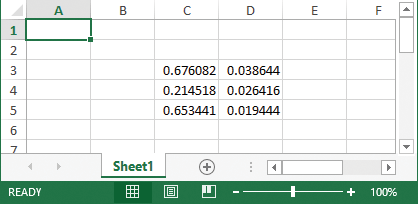
. matrix a = r(table)
. matrix b = a[1 ..2,1 ...]'
. putexcel set 401k_report.xlsx
But my table is not quite publication-ready yet.
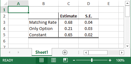
I can add bold column titles, “Estimate” and “S.E.”, and a cell border between the title and results to the worksheet by typing
. putexcel C3=matrix(b)
. putexcel C2=("Estimate")
. putexcel D2=("S.E.")
. putexcel (C2:D2), bold
. putexcel (B2:D2), border("bottom", "thin")
To add row labels and a cell border between the label and results, I type
. putexcel B3=("Matching Rate") B4=("Only Option") B5=("Constant")
. putexcel (B2:B5), border("right", "thin")
. putexcel (B5:D5), border("bottom", "double")
Now, I want to center the column text and results and format the numeric output to two decimals:
. putexcel (C3:D5), nformat("number_sep_d2")
. putexcel (C2:D5), hcenter
I now have a nice-looking table.
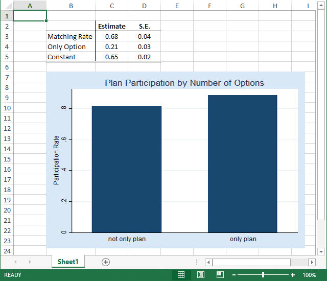
But, putexcel can do even more. You can also write a wide range of graph file formats, including PNG, JPEG, WMF, and TIFF.
For example, I can add a bar graph of the average participation rate for companies over whether the 401(k) is the only retirement option offered by typing
. graph bar (mean) prate, over(sole) ytitle("Participation Rate")
        title("Plan Participation by Number of Options")
. graph export bar1.png
. putexcel (B7)=picture("bar1.png")
My worksheet now looks like this:
There are many more formats and settings that you can change in Excel by using putexcel. To view a list, see [P] putexcel.
— Kevin Crow
Senior Software Developer, StataCorp


