
1 item has been added to your cart.
graph is easy to use:
        . sysuse auto, clear

        . graph twoway scatter mpg weight
)
All the graph commands begin with the word graph, but in many instances the graph is optional. You could get the same graph by typing
. twoway scatter mpg weightand, in the case of scatter, you could omit the twoway, too:
. scatter mpg weightWe, however, will continue to type twoway to emphasize when the graphs we are demonstrating are in the twoway family.
Twoway graphs can be combined with by():
. twoway scatter mpg weight, by(foreign)
)
Graphs in the twoway family can also be overlaid. The members of the twoway family are called plottypes; scatter is a plottype, and another plottype is lfit, which calculates the linear prediction and plots it as a line chart. When we want one plottype overlaid on another, we combine the commands, putting || in between:
. twoway scatter mpg weight || lfit mpg weight
)
Another notation for this is called the ()-binding notation:
. twoway (scatter mpg weight) (lfit mpg weight)It does not matter which notation you use.
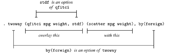
Overlaying can be combined with by(). This time, we will substitute qfitci for lfit. qfitci plots the prediction based on a quadratic regression, and it adds a confidence interval. We will add the confidence interval based on the standard error of the forecast:
. twoway (qfitci mpg weight, stdf) (scatter mpg weight), by(foreign)

We used the ()-binding notation just because it makes it easier to see what modifies what:
We could just as well have typed this command using the ||-separator notation,
. twoway qfitci mpg weight, stdf || scatter mpg weight ||, by(foreign)and, as a matter of fact, we do not have to separate the twoway option by(foreign) (or any other twoway option) from the qfitci and scatter options, so we can type
. twoway qfitci mpg weight, stdf || scatter mpg weight, by(foreign)or even
. twoway qfitci mpg weight, stdf by(foreign) || scatter mpg weightIn our opinion, the ()-binding notation is easier to read, but the ||-separator notation is easier to type.
Plots of different types or the same type may be overlaid:
        . sysuse uslifeexp, clear

        . twoway line le_wm year || line le_bm year
)
Here is a rather fancy version of the same graph:
        . generate diff = le_wm - le_bm

        . twoway line le_wm year, yaxis(1 2) xaxis(1 2)
              || line le_bm year
              || line diff  year
              || lfit diff  year
              ||,
                 ytitle( "",         axis(2) )
                 xtitle( "",         axis(2) )
                 xlabel( 1918,       axis(2) )
                 ylabel( 0(5)20,     axis(2) gmin angle(horizontal) )
	         ylabel( 0 20(10)80,         gmax angle(horizontal) )
	         ytitle( "Life expectancy at birth (years)" )
	         title( "White and black life expectancy" )
	         subtitle( "USA, 1900-1999" )
	         note( "Source: National Vital Statistics, Vol 50, No. 6"
	               "(1918 dip caused by 1918 Influenza Pandemic)" )
	         legend( label(1 "White males") label(2 "Black males") )
)
There are a lot of options on this command! Strip away the obvious ones, such as title(), subtitle(), and note(), and you are left with
        . twoway line le_wm year, yaxis(1 2) xaxis(1 2)
              || line le_bm year
              || line diff  year
              || lfit diff  year
              ||,
                 ytitle( "",         axis(2) )
                 xtitle( "",         axis(2) )
                 xlabel( 1918,       axis(2) )
                 ylabel( 0(5)20,     axis(2) gmin angle(horizontal) )
                 ylabel( 0 20(10)80,         gmax angle(horizontal) )
                 legend( label(1 "White males") label(2 "Black males") )
Let's take the longest option first:
ylabel( 0(5)20, axis(2) gmin angle(horizontal) )The first thing to note is that options have options:
ylabel( 0(5)20, axis(2) gmin angle(horizontal) )
Now look back at our graph. It has two y axes, one on the right and a second on the left. What
ylabel( 0(5)20, axis(2) gmin angle(horizontal) )did was cause the right axis—axis(2)—to have labels at 0, 5, 10, 15, and 20—0(5)20. gmin forced the grid line at 0 because, by default, graph does not like to draw grid lines too close to the axis. angle(horizontal) turned the 0, 5, 10, 15, and 20 to be horizontal rather than, as usual, vertical.
You can now guess what
ylabel( 0 20(10)80, gmax angle(horizontal) )did. It labeled the left y axis—axis(1) in the jargon—but we did not have to specify an axis(1) suboption since that is what ylabel() assumes. The purpose of
xlabel( 1918, axis(2) )is now obvious, too. That labeled a value on the second x axis.
So now we are left with
        . twoway line le_wm year, yaxis(1 2) xaxis(1 2)
              || line le_bm year
              || line diff  year
              || lfit diff  year
              ||,
                 ytitle( "",         axis(2) )
                 xtitle( "",         axis(2) )
                 legend( label(1 "White males") label(2 "Black males") )
Options ytitle() and xtitle() specify the axis
titles. We did not want titles on the second axes, so we got rid of them.
The legend() option,
legend( label(1 "White males") label(2 "Black males") )merely respecified the text to be used for the first two keys. By default, legend() uses the variable label, which in this case would be the labels of variables le_wm and le_bm. In our dataset those labels are "Life expectancy, white males" and "Life expectancy, black males". It was not necessary—and undesirable—to repeat "Life expectancy", so we specified an option to change the label. It was either that or change the variable label.
So now we are left with
        . twoway line le_wm year, yaxis(1 2) xaxis(1 2)
              || line le_bm year
              || line diff  year
              || lfit diff  year
and that is almost perfectly understandable. The yaxis() and
xaxis() options are what caused the creation of two y
and two x axes rather than, as usual, one.
Understand how we arrived at
        . twoway line le_wm year, yaxis(1 2) xaxis(1 2)
              || line le_bm year
              || line diff  year
              || lfit diff  year
              ||,
                 ytitle( "",         axis(2) )
                 xtitle( "",         axis(2) )
                 xlabel( 1918,       axis(2) )
                 ylabel( 0(5)20,     axis(2) gmin angle(horizontal) )
                 ylabel( 0 20(10)80,         gmax angle(horizontal) )
                 ytitle( "Life expectancy at birth (years)" )
                 title( "White and black life expectancy" )
                 subtitle( "USA, 1900-1999" )
                 note( "Source: National Vital Statistics, Vol 50, No. 6"
	               "(1918 dip caused by 1918 Influenza Pandemic)" )
                 legend( label(1 "White males") label(2 "Black males") )
We started with the first graph we showed you,
. twoway line le_wm year || line le_bm yearand then, to emphasize the comparison of life expectancy for whites and blacks, we added the difference,
        . generate diff = le_wm - le_bm

        . twoway line le_wm year,
              || line le_bm year
              || line diff  year
and then, to emphasize the linear trend in the difference, we added
"lfit diff year",
        . twoway line le_wm year,
              || line le_bm year
              || line diff  year,
              || lfit diff  year
and then we added options to make the graph look more like we wanted.
The options we introduced one at a time. Rather fun, really.
As our command grew, we switched to using the Do-file Editor.
While we are on the subject of life expectancy, using another dataset, we
drew
)
Along the same lines is
)
which we drew by separately drawing three rather easy graphs:
        . twoway scatter lexp loggnp,
	        yscale(alt) xscale(alt)
	        xlabel(, grid gmax)              saving(yx)

        . twoway histogram lexp, fraction
	        xscale(alt reverse) horiz        saving(hy)

        . twoway histogram loggnp, fraction
	        yscale(alt reverse)
	        ylabel(,nogrid)
	        xlabel(,grid gmax)               saving(hx)
and then combining them into one:
        . graph combine hy.gph yx.gph hx.gph,
	        hole(3)
	        imargin(0 0 0 0) grapharea(margin(l 22 r 22))
	        title("Life expectancy at birth vs. GNP per capita")
	        note("Source:  1998 data from The World Bank Group")
Returning to our tour, twoway, by() can produce graphs that
look like this:
        . sysuse auto, clear

        . scatter mpg weight, by(foreign, total row(1))
)
or like this
. scatter mpg weight, by(foreign, total col(1))
)
or like this
. scatter mpg weight, by(foreign, total)
)
There are lots of plottypes within the twoway family, including areas, bars, spikes, dropped lines, and dots. Just to illustrate a couple:
        . sysuse sp500, clear

        . replace volume = volume/1000

        . twoway
	        rspike hi low date ||
	        line   close  date ||
	        bar    volume date, barw(.25) yaxis(2) ||
          in 1/57
          , yscale(axis(1) r(900 1400))
            yscale(axis(2) r(  9   45))
            ytitle("                          Price -- High, Low, Close")
            ytitle(" Volume (millions)", axis(2) astext just(left))
            legend(off)
            subtitle("S&P 500", margin(b+2.5))
            note("Source:  Yahoo!Finance and Commodity Systems, Inc.")
)
Moving outside the twoway family, graph can draw scatterplot matrices, box plots, pie charts, and bar and dot plots. Here's an example of each:
Scatterplot matrix:
        . sysuse lifeexp, clear

        . generate lgnppc = ln(gnppc)

        . gr matrix popgr lexp lgnppc safe, maxes(ylab(#4, grid) xlab(#4, grid))
)
Box plot:
     . sysuse bplong, clear

     . graph box bp, over(when) over(sex)
	     ytitle("Systolic blood pressure")
	     title("Response to Treatment, by Sex")
	     subtitle("(120 Preoperative Patients)" " ")
	     note("Source:  Fictional Drug Trial, StataCorp, 2003")
)
Pie chart:
     . graph pie sales marketing research development,
	     plabel(_all name, size(*1.5) color(white))
	     legend(off)
	     plotregion(lstyle(none))
	     title("Expenditures, XYZ Corp.")
	     subtitle("2002")
	     note("Source:  2002 Financial Report (fictional data)")
)
Vertical and horizontal bar charts:
     . sysuse nlsw88, clear

     . graph bar (mean) wage,
		     over( smsa, descend gap(-30) )
		     over( married )
		     over( collgrad, relabel(0 "Not college graduate"
				             1 "College graduate"    ) )
		     ytitle("")
		     title("Average Hourly Wage, 1988, Women Aged 34-46")
		     subtitle("by College Graduation, Martial Status,
			       and SMSA residence")
		     note("Source:  1988 data from NLS, U.S. Dept of Labor,
		           Bureau of Labor Statistics")
)
     . sysuse educ99gdp, clear

     . gen total = private + public

     . graph hbar (asis) public private,
		     over(country, sort(total) descending)
		     stack
		     title("Spending on tertiary education as % of GDP,
		            1999", span position(11) )
		     subtitle(" ")
		     note("Source:  OECD, Education at a Glance 2002", span)
)
Dot chart:
        . graph dot (mean) wage,
	        over(occ, sort(1))
	        by(collgrad,
	             title("Average hourly wage, 1988, women aged 34-46", span)
	             subtitle(" ")
	             note("Source:  1988 data from NLS, U.S. Dept. of Labor,
	                   Bureau of Labor Statistics", span)
	        )
)


