
1 item has been added to your cart.
| Title | Joining paired points on a graph | |
| Author | Nicholas J. Cox, Durham University, UK |
Note: This FAQ concerns some special graphs of paired observations. If you have multiple measurements per observation and want to generate more standard high-low type charts, these can be created with the connect(||) and connect(II) graph options; see [G] connect.
Suppose you have data reflecting paired measurements, taken before and after an intervention, and you want to draw a graph that joins before and after values, observation by observation.
This can be read in two ways:
Specifically: you have data before and after and want a scatter plot in which before and after are responses on the y-axis and the variable on the x-axis is set to a low or a high constant for before and after, respectively. before should be joined to after for each observation.
        |
        |  *
        |   *
        |    *
        |  ********
        |      *
        |       *
        |        *
        |         *
        +-------------
         before after
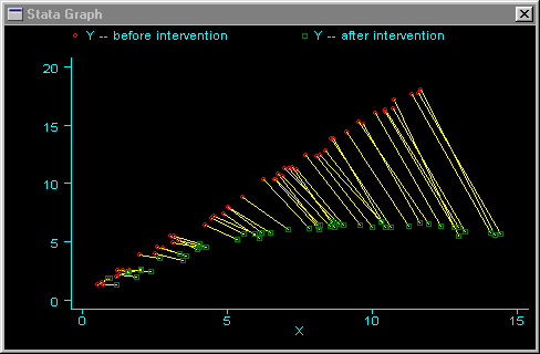
More generally: suppose that we have data as variables x1 y1 (= before) x2 y2 (= after). We want to join pairs of points (x1, y1) and (x2, y2). I will show how to do this more general case first.
. gen id = _n
. stack x1 y1 id x2 y2 id, into(X Y ID) clear
        . egen Xmin = min(X), by(ID)
        . gsort -Xmin ID X
        . gen Y1 = Y if _stack == 1
        . gen Y2 = Y if _stack == 2
        . graph Y Y1 Y2 X, c(L..) sy(iop)
Here is an example of this type of graph. In this case, we are assuming that both X and Y receive some stochastic effect from the regime change.
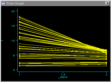
. gen id = _n
        . stack y1 id y2 id, into(Y ID) clear
        . sort ID _stack
        . graph Y _stack, c(L)
In this second type of graph, we are not considering the x variable at all. Using the same Y-data from the prior graph, we obtain the following:
This kind of scatterplot and other plots for this problem are discussed in McNeil (1992).


