
1 item has been added to your cart.
| Title | Showing scale breaks on graphs | |
| Authors |
Nicholas J. Cox, Durham University, UK Scott Merryman, Risk Management Agency/USDA |
Stata’s graphics commands do not include facilities for a scale break in which either the y axis or the x axis of a graph is interrupted. The presumption is that when faced with, for example, outliers in a dataset you will be better advised to consider a log scale by using a yscale(log) or xscale(log) option. Alternatively, perhaps your data would benefit from some other nonlinear transformation before graphing. Either way, many writers on graphics discourage the use of scale breaks as being at best awkward and at worst difficult to interpret correctly.
Without moralizing too much on what you should or should not be doing, we must point out another issue. Stata’s graphics, particularly twoway graphs, are designed to allow you to superimpose or combine graphs that are compatible. To allow both this and scale breaks is well nigh impossible or, at least, was judged unworthy of the effort.
Nevertheless, there are cases when a log scale is not advisable or when you decide that a scale break is preferable anyway. Scale breaks can indeed be simulated in Stata to some extent with various little tricks. Let’s look at two examples.
Consider these population estimates from McEvedy and Jones (1978, 342–351). The variables are year (negative values denote BCE) and estimated world population in millions.
  . list year population

       +-------------------+
       |   year   popula˜n |
       |-------------------|
    1. | -10000          4 |
    2. |  -5000          5 |
    3. |  -4000          7 |
    4. |  -3000         14 |
    5. |  -2000         27 |
       |-------------------|
    6. |  -1000         50 |
    7. |   -500        100 |
    8. |   -200        150 |
    9. |      1        170 |
   10. |    200        190 |
       |-------------------|
   11. |    400        190 |
   12. |    500        190 |
   13. |    600        200 |
   14. |    700        210 |
   15. |    800        220 |
       |-------------------|
   16. |    900        240 |
   17. |   1000        265 |
   18. |   1100        320 |
   19. |   1200        360 |
   20. |   1300        360 |
       |-------------------|
   21. |   1400        350 |
   22. |   1500        425 |
   23. |   1600        545 |
   24. |   1650        545 |
   25. |   1700        610 |
       |-------------------|
   26. |   1750        720 |
   27. |   1800        900 |
   28. |   1850       1200 |
   29. |   1900       1625 |
   30. |   1950       2500 |
       +-------------------+
Let’s look at a basic graph:
  . label var pop "world population, millions"

  . scatter pop year, xlabel(-10000(2000)2000) ylabel(0(500)2500, angle(h)) ms(oh)
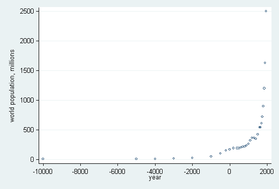
The sparsity of data for the earlier part of the record and the rapid rate of increase in the last few centuries combine to produce a crowded right-hand portion of the graph. Yet a log scale for year would certainly not help here, as it would exacerbate the problem, even if we could decide on an appropriate origin for log(year − origin). (A log scale for population would be sensible, but that is a separate question.)
The gap between the first two values of year of 5,000 years is almost 5/12 the range of that variable. We will show how to move the first value closer to the rest of the values and thus simulate a scale break.
We will copy year and in the copy move the first value closer to the rest, except that the value label will not lie. Then the graph can be drawn with a vertical line to mark the break:
   . gen Year = cond(year == -10000, -7000, year)
   . label def Year -7000 "-10000"
   . label val Year Year
   . label var Year year
   . scatter pop Year, xlabel(-7000 -5000(1000)2000, valuelabel)
   > ylabel(0(500)2500, angle(oh)) xline(-6000) ms(oh)
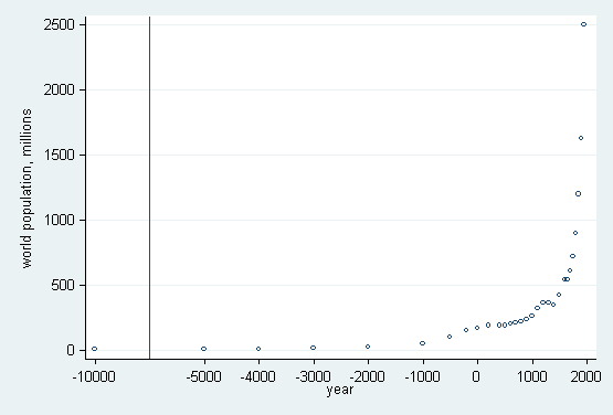
However, value labels can be attached only to integers; see [D] label. A more general trick is that we can type something like xlabel(-7000 "-10000" -5000(1000)2000), indicating that −7000 is really −10000. We can do that with nonintegers also. The numerical values in the variables have been fudged for this purpose.
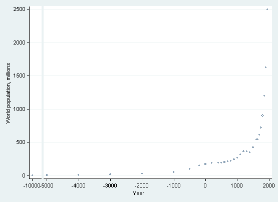
Another way to simulate a scale break is to plot the values separately and then combine them into one graph. This approach creates a visible break in the axis, but it requires more complicated graph statements.
The first graph will be the left panel. We do not want the two panels to be the same size, so we need to specify the fxsize() option. As we are only plotting one point, we need to specify two labels on the x axis but specify that one of them is an explicit blank, " ", and we need to remove the two tick marks but add one tick mark at −10000.
   . twoway scatter pop year if year < -5000, name(gr1,replace)
   > xlabel(-10000 -9999 " ", labgap(*3)  notick)
   > xtick(-10000) fxsize(18) xtitle("") yla(, ang(h))  ms(oh)
The second graph will be the right panel. Here we need to remove the y-axis and x-axis title.
   . twoway scatter pop year if year >= -5000, name(gr2,replace)
   > yscale(off) xtitle("") xlabel(-5000(1000)2000) ms(oh)
Finally, we combine the two panels into one graph and impose a common x-axis title.
   . graph combine gr1 gr2, cols(2) imargin(vsmall) ycommon
   > b2title(year, size(small))
To illustrate another approach, we make ourselves a sandbox to play in by generating some spiky time series as the reciprocals of uniformly distributed random numbers. We expect a minimum of 1 and a median of 2 but will sometimes get some much larger numbers.
  . set obs 100
  . set seed 2803
  . forval i = 1/4 {
    2.      gen y`i' = 1/uniform()
    3. }
  . gen x = _n
After a peek at summary statistics, we choose to chop values at 100 but show higher values by text on the graph positioned just above that. In practice, we may want to loop over responses, so we initialize what we show and where we show it:
  . gen high = ""
  . gen High = 105
In a loop, we use clonevar to keep the originals safe. We then replace the large values with missing values but put their values into the string variable high that we just initialized. In the graph command, note the option cmissing(n) and the marker label options. Horizontal text labels for the outliers are preferable whenever outliers are not too close to inhibit that, but we leave them vertical here. In real data, outliers are much more likely to be supported by values on both sides, so vertical may be the best option here.
  . quietly forval i = 1/4 {
    2. 	    clonevar temp = y`i'
    3.	    replace temp = . if y`i' > 100
    4.	    replace high = cond(y`i' > 100, string(y`i',"%4.1f"), "")
    5. 	    line temp x, sort cmissing(n) || scatter High x, ms(none) ///
  		 mlabel(high) mlabpos(0) mlabangle(90) mlabsize(small) ///
  		 legend(off) ytitle(y`i') yscale(r(. 110)) ylabel(, angle(h))
    6.	    graph save y`i', replace
    7.	    drop temp
    8. }
Finally, we put it all together in a portfolio:
. graph combine "y1" "y2" "y3" "y4", imargin(zero)
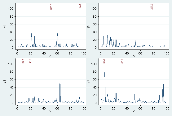
This example is indicative, not definitive. The main point is that you can use the basic graphics commands to simulate features that you may want, with no low-level programming.
For further discussion, see Cox (2012).


