1 item has been added to your cart.
| Title | Getting histograms with varying bin widths | |
| Author | Nicholas J. Cox, Durham University, UK |
The principle behind histograms is that the area of each bar represents the fraction of a frequency (probability) distribution within each bin (class, interval). Among many books explaining histograms, Freedman, Pisani, and Purves (2007) is an outstanding introductory text that strongly emphasizes the area principle. It is not part of the definition that all bins have the same width but rather that what is shown on the vertical axis is, or is proportional to, probability density. Frequency density qualifies, as does frequency if all bins have the same width.
In practice, however, most histograms produced or published do have equal-width bins. Official Stata users in particular have only been offered these options:
Why? Various arguments for and against this inflexibility may be identified.
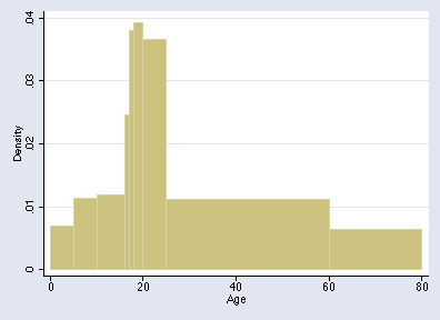
For example, Altman (1991, 25) gives the ages of 815 road accident casualties for the London Borough of Harrow in 1985:
        Age       Frequency
        ---       ---------
        0-4           28
        5-9           46
      10-15           58
         16           20
         17           31
      18-19           64
      20-24          149
      25-59          316
        60+          103
In this example and in other similar examples, density can only be calculated for the open-ended class if we specify an upper limit; Altman suggests that 60+ be treated as 60–80.
What can be done in Stata?
A community-contributed program for Stata 8 and later versions for equal-probability histograms can be described and, if desired, downloaded from SSC by typing
        . ssc desc eqprhistogram
        . ssc inst eqprhistogram
As an illustration, here is the result of
        . use http://www.stata-press.com/data/r9/womenwage.dta
        . eqprhistogram wage, bin(10) plot(kdensity wage, biweight w(5))
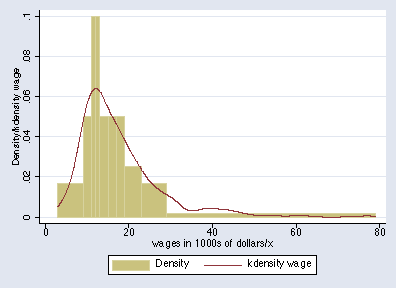
The bin limits are the deciles, so each bar represents 1/10 of the total probability in the distribution. You can superimpose a density estimate.
An equal probability histogram is not suitable for all distributions. Given categorical, discrete, or highly rounded data, quantiles may be tied, especially if the number of bins is large relative to the sample size. If the specified quantiles are tied, eqprhistogram refuses to draw the graph.
For other histograms with varying widths, if you have Stata 7 or Stata 6 you can specify bin limits to two community-contributed programs, barplot and hist3. hist3 is more general, in that it will calculate densities for you. To describe or install either of these, use ssc as above, or see http://www.stata.com/support/faqs/resources/findit-and-ssc-commands/ for guidance.
In Stata 8, much can be done once you know about an undocumented feature of twoway bar. We need to enter the lower bin limits and the bin frequencies and one final upper limit as data. For Altman's example, we enter
          +-----------------+
          | Age   Frequency |
          |-----------------|
       1. |   0          28 |
       2. |   5          46 |
       3. |  10          58 |
       4. |  16          20 |
       5. |  17          31 |
          |-----------------|
       6. |  18          64 |
       7. |  20         149 |
       8. |  25         316 |
       9. |  60         103 |
      10. |  80           . |
          +-----------------+
We then can calculate the densities
. gen Density = Freq / (815 * (Age[_n+1] - Age))
If you want frequency density rather than probability density, you should omit scaling by the sample size (here 815).
Finally, we can draw the graph:
. twoway bar Density Age, bartype(spanning) bstyle(histogram)
The "spanning" extends bars to the right until they are curtailed; this is why it is necessary to specify all lower limits and one upper limit for the graph. The data should also be in the correct sort order, as in this example. The option bstyle(histogram) is not compulsory, and you might like to check other possibilities. You might need to add the option yscale(range(0)) if twoway bar does not automatically start bars at 0.
Marcello Pagano urged the merits of equal-probability histograms. Vince Wiggins alerted me to spanning bars.


