
1 item has been added to your cart.
Margins plots were introduced in Stata 12.
Order |
New in Stata 12 is the marginsplot command, which makes it easy to graph statistics from fitted models. marginsplot graphs the results from margins, and margins itself can compute functions of fitted values after almost any estimation command, linear or nonlinear.
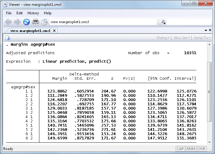
Suppose we’ve just fit a two-way ANOVA of systolic blood pressure on age group, sex, and their interaction. We can estimate the response for each cell with margins:
To study the interaction it would be nice to see a graph. In Stata 12 we no longer have to construct the graph manually; we can instead just type marginsplot:
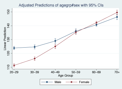
marginsplot automatically chooses the y-variable and x-variable and adds confidence intervals. We don’t have to stick with the defaults, though: marginsplot includes a rich set of options for changing axis definitions, labels, curves, confidence intervals, and more.
marginsplot also supports the new features of the margins command, including the contrast operators. Let’s contrast women with men in each age group and plot the contrasts:
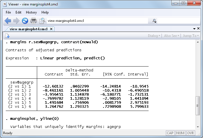
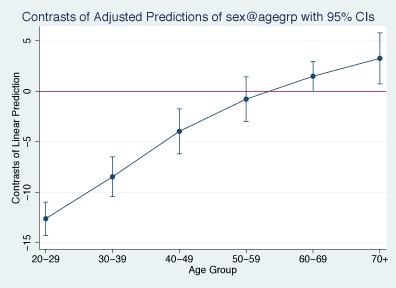
We see that systolic blood pressure is lower in younger women than in younger men. But among the old, the relationship is reversed, and women have higher blood pressure than men.
marginsplot works with nonlinear models, too. Suppose we've fit a logistic regression, modeling the probability of high blood pressure as a function of sex, age group, body mass index, and their interactions. marginsplot can contrast women with men on the probability scale:
. quietly margins r.sex, at(bmi=(10(1)65))

. marginsplot, xlabel(10(10)60) recast(line) recastci(rarea)

Variables that uniquely identify margins: bmi
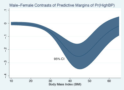
We’ve only scratched the surface—anything that margins can compute, marginsplot can graph.
See New in Stata 19 to learn about what was added in Stata 19.


