Notice: On April 23, 2014, Statalist moved from an email list to a forum, based at statalist.org.
[Date Prev][Date Next][Thread Prev][Thread Next][Date Index][Thread Index]
Re: st: level and distribution plot side by side
From
Nick Cox <[email protected]>
To
[email protected]
Subject
Re: st: level and distribution plot side by side
Date
Sat, 5 Jan 2013 12:27:26 +0000
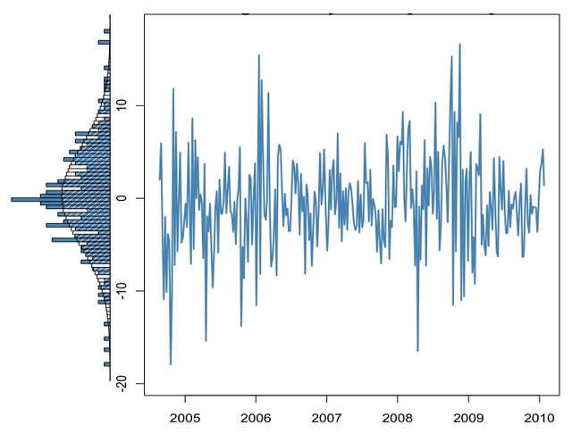
Here is an example.

sysuse sp500, clear

histogram close, horizontal xsc(reverse) normal freq ysc(off)
fxsize(20) name(g1, replace) width(10)

line close date, ysc(alt) yla(, ang(h)) name(g2, replace) xla(,
format(%tddd_Mon)) xtitle("2001")

graph combine g1 g2, ycommon imargin(small)

However, this example does not imply that I just wrote down these
commands. No; this is the cleaned-up version after making numerous
small changes. Open a do-file editor with a script once you have
commands that work, expect to have to make many tweaks. -name(,
replace)- is a crucial detail.

Nick


On Sat, Jan 5, 2013 at 10:37 AM, Nick Cox <[email protected]> wrote:
> See -help graph combine- and then the manual entry. In Stata terms,
> you combine using graphs from -twoway histogram- and -twoway line-.
>
> Nick
>
> Patrick Toche <[email protected]> wrote:
>
>> I saw this very nice graph: the main graph area has a twoway line of some
>> very spiky data, in a standard horizontal orientation; immediately next to
>> it, on the left-hand side, is a frequency plot displayed sideways.
>>
>> Does anyone have sample code for this sort of display?
>>
>> many thanks.
>>
>> A picture speaks a thousand words:
>> http://www5.picturepush.com/photo/a/11879063/640/11879063.jpg
*
*   For searches and help try:
*   http://www.stata.com/help.cgi?search
*   http://www.stata.com/support/faqs/resources/statalist-faq/
*   http://www.ats.ucla.edu/stat/stata/