Notice: On April 23, 2014, Statalist moved from an email list to a forum, based at statalist.org.
[Date Prev][Date Next][Thread Prev][Thread Next][Date Index][Thread Index]
Re: st: level and distribution plot side by side
From
annoporci <[email protected]>
To
[email protected]
Subject
Re: st: level and distribution plot side by side
Date
Sun, 06 Jan 2013 02:46:54 +0800
Here is an example.
[ ...]
However, this example does not imply that I just wrote down these
commands. No; this is the cleaned-up version after making numerous
small changes. Open a do-file editor with a script once you have
commands that work, expect to have to make many tweaks. -name(,
replace)- is a crucial detail.

Nick
This is stunning Nick, thanks a lot!

It will come in very handy.

I need to play with it at once.
I've been exploring Stata's graphing capabilities for some data
description project I'm working on.
There are 2 things I've spent a little bit of time on. Maybe I can share
what little I've learned.
1) The objective is to have the level and growth rate of a variable on the
same graph, with the level using a log scale on the left-hand side and the
growth rate using a standard scale on the right-hand side (using a
standard landscape display).
I've adapted code from the Stata Manual, but it's not exactly right yet.
At the time, I didn't know about the graph combine command, so I'm
producing both lines in the same graph, trying to push the level line up
and the growth line down so they do not intersect.
The problem I ran into is that if I plot the level line and growth line
sufficiently far apart, they become squeezed and ugly. What I need, I
think, is to stretch the plotregion (and graphregion?) vertically, so as
to accommodate both lines. I haven't worked that out yet.
But maybe I should rewrite the whole thing using your -graph combine-
approach; it would be more versatile...
By running the code below or clicking on the link to the image (no idea
how long this link will be active) will show the deficiencies of the
approach below.
 clear all
 webuse dow1,clear
 tsset t
 generate dayofwk = dow(date)
 list date dayofwk t ln_dow D.ln_dow in 1/8
 list date dayofwk t ln_dow D.ln_dow in -8/l
 generate Dlndow = D.ln_dow

 #delimit ;
 twoway (tsline dowclose, yaxis(1) lcolor(blue))
        (spike Dlndow date, yaxis(2) lcolor(cranberry))
      , yscale(log axis(1) range(50 3000))
        ylabel(500 1000 2000 3000, grid labsize(small) axis(1))
		ytitle("Index", axis(1))
        yline(250, axis(1) lstyle(foreground))
		yscale(range(-.3 .3) axis(2))
        ylabel(-.3 -.2 -.1 0 +.1, grid labsize(vsmall) axis(2))
		ytitle("Returns", axis(2))
        legend(off)
        title("DJIA, index and returns", margin(b+2.5))
		note("2 Jan 1953 - 20 Feb 1990")
        graphregion(fcolor(none) margin(none))
        plotregion(margin(none))
		aspect(0.75)
 ; #delimit cr

The output looks like this:
http://www4.picturepush.com/photo/a/11882877/640/11882877.jpg
The growth line overlaps with the level line, which is not pretty; also,
the grids overlap too, which is worse (this could be fixed by removing the
grid on the right-hand axis, but I sort of cared about keeping it).
And another plot-related thing I've learned:
2) I discovered a very useful piece of code to have the labels of a log
plot display powers of 10.
It is on Rense Corten's blog (comments off):
http://www.rensecorten.dds.nl/index.php/2011/03/labeling-logarithmic-axes-in-stata-graphs/

It's similar to something you wrote on Statalist back in 2003:
http://www.stata.com/statalist/archive/2003-11/msg00770.html

I adapted it to make it a little more systematic, e.g. writing:

forval x = `expmin'(`expstp')`expmax'{

instead of say

forval x = 2(1)5{
and I have set up some calculations beforehand decide what the values of
expmin, expstp, expmax should be, based on the data being graphed.
The whole thing could be wrapped into a program (by someone more able than
me).
I hesitate to post my version of the code since the original was not
written by me.
There isn't an awful lot I can give back to Statalist now, but hopefully
some day...
Thanks Nick.
--
Patrick Toche.
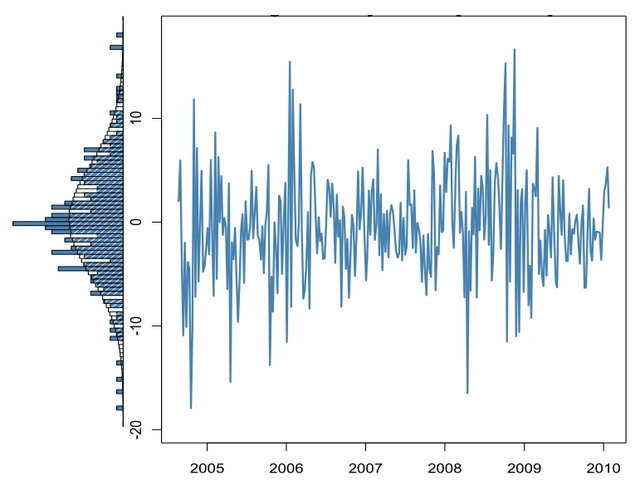
Here is an example.
sysuse sp500, clear
histogram close, horizontal xsc(reverse) normal freq ysc(off)
fxsize(20) name(g1, replace) width(10)
line close date, ysc(alt) yla(, ang(h)) name(g2, replace) xla(,
format(%tddd_Mon)) xtitle("2001")
graph combine g1 g2, ycommon imargin(small)
However, this example does not imply that I just wrote down these
commands. No; this is the cleaned-up version after making numerous
small changes. Open a do-file editor with a script once you have
commands that work, expect to have to make many tweaks. -name(,
replace)- is a crucial detail.
Nick
On Sat, Jan 5, 2013 at 10:37 AM, Nick Cox <[email protected]> wrote:
See -help graph combine- and then the manual entry. In Stata terms,
you combine using graphs from -twoway histogram- and -twoway line-.
 Nick
 Patrick Toche <[email protected]> wrote:
I saw this very nice graph: the main graph area has a twoway line of
some
very spiky data, in a standard horizontal orientation; immediately next
to
it, on the left-hand side, is a frequency plot displayed sideways.
 Does anyone have sample code for this sort of display?
 many thanks.
 A picture speaks a thousand words:
http://www5.picturepush.com/photo/a/11879063/640/11879063.jpg
*
*   For searches and help try:
*   http://www.stata.com/help.cgi?search
*   http://www.stata.com/support/faqs/resources/statalist-faq/
*   http://www.ats.ucla.edu/stat/stata/
*
*   For searches and help try:
*   http://www.stata.com/help.cgi?search
*   http://www.stata.com/support/faqs/resources/statalist-faq/
*   http://www.ats.ucla.edu/stat/stata/