
In the spotlight: Visualizing continuous-by-continuous interactions with margins and twoway contour
Did you know that you can use margins and twoway contour to graph predictions from models that include continuous-by-continuous interactions? Well you can, and it is easy once you know about an undocumented option in margins.
Graphs often can illustrate the results of a model more effectively than a written interpretation, especially for a nontechnical audience. This is particularly true for models with interaction terms. Stata's margins and marginsplot commands are powerful tools for creating graphs for complex models, including those with interactions. Today, I want to show you how to use margins and twoway contour to graph predictions from a model that includes an interaction between two continuous covariates.
The model
The nhanes2 dataset used below contains an indicator variable for hypertension (highbp) and the continuous variables age and weight.
. webuse nhanes2, clear

. describe highbp age weight
| storage display value variable name type format label variable label |
| highbp byte %8.0g 1 if bpsystol >= 140|bpdiast >= 90, 0 otherwise age byte %9.0g age in years weight float %9.0g weight (kg) |
| Variable | Obs Mean Std. Dev. Min Max | |
| highbp | 10,351 .4227611 .494022 0 1 | |
| age | 10,351 47.57965 17.21483 20 74 | |
| weight | 10,351 71.89752 15.35642 30.84 175.88 |
Let's fit a logistic regression model using age, weight, and their interaction as predictors of the probability of hypertension. We include the svy: prefix because this dataset contains survey weights.
. svy: logistic highbp age weight c.age#c.weight
(running logistic on estimation sample)

Survey: Logistic regression

Number of strata   =        31                Number of obs     =       10,351
Number of PSUs     =        62                Population size   =  117,157,513
                                              Design df         =           31
                                              F(   3,     29)   =       418.97
                                              Prob > F          =       0.0000
| Linearized | ||
| highbp | Odds Ratio Std. Err. t P>|t| [95% Conf. Interval] | |
| age | 1.100678 .0088786 11.89 0.000 1.082718 1.118935 | |
| weight | 1.07534 .0063892 12.23 0.000 1.062388 1.08845 | |
| c.age#c.weight | .9993975 .0001138 -5.29 0.000 .9991655 .9996296 | |
| _cons | .0002925 .0001194 -19.94 0.000 .0001273 .0006724 | |
The logistic command automatically transforms the coefficients to odds ratios, which makes them easier to interpret. However, even this easier-to-interpret metric is not straightforward when we include the interaction of the covariates.
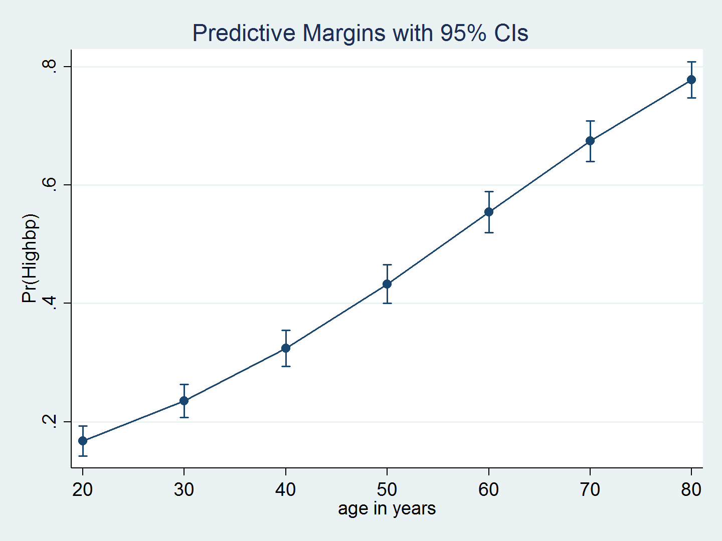
We can use margins and marginsplot to graph predictions from the model, which more clearly illustrates the relationship between age and the probability of hypertension. Because we have survey data, we include the vce(unconditional) option to obtain standard errors appropriate for population inferences. The average probability of hypertension increases with age.
. quietly margins, at(age=(20(10)80)) vce(unconditional)
. marginsplot
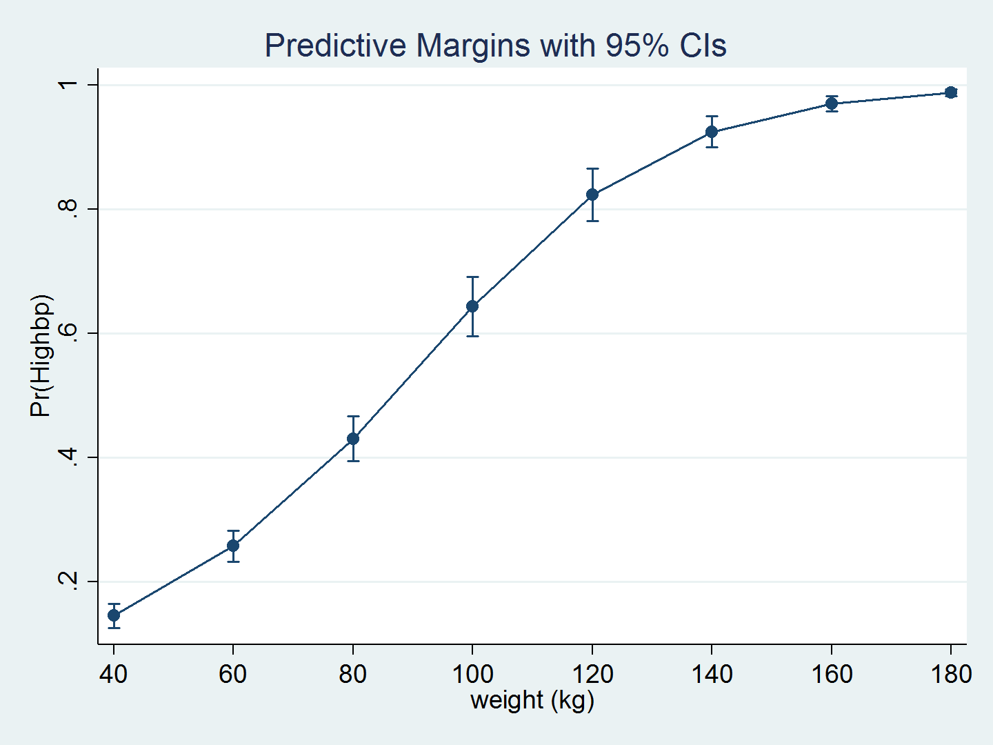
We can again use margins and marginsplot to graph the predictions over weight.
. quietly margins, at(weight=(40(20)180)) vce(unconditional)
. marginsplot
Understanding the interaction of age and weight poses a serious challenge. The odds ratio for each individual variable is greater than 1, but the odds ratio for the interaction is less than 1. Actually, it is essentially equal to the null value of 1, but its p-value is 0.000. What does this mean?!?
I am not going to attempt to interpret the odds ratio for the interaction term, but we can create a graph of the predictions from the model by using margins and twoway contour.
We begin by using margins to calculate the predicted probability of hypertension for all combinations of age, ranging from 20 to 80 years in increments of 5 years, and weight, ranging from 40 to 180 kilograms in increments of 5 kilograms. We use the quietly prefix to suppress the lengthy output that results from this command. We also use the undocumented option saving(predictions, replace), which saves the results of margins to the dataset predictions.dta.
. quietly margins, at(age=(20(5)80) weight=(40(5)180)) vce(unconditional) saving(predictions, replace)
The dataset predictions.dta contains the variables _at1 and _at2, which correspond to the values of age and weight that we specified in the at() option. The dataset also contains the variable _margin, which is the marginal prediction of the probability of high blood pressure.
. use predictions, clear
(Created by command margins; also see char list)

. list _at1 _at2 _margin in 1/5
| _at1 _at2 _margin | |||
| 1. | 20 40 .021986 | ||
| 2. | 20 45 .0295349 | ||
| 3. | 20 50 .0395708 | ||
| 4. | 20 55 .0528314 | ||
| 5. | 20 60 .0702107 | ||
I prefer to use variable names that mean something to me, so I rename _at1, _at2, and _margin.
. rename _at1 age

. rename _at2 weight

. rename _margin pr_highbp

. list age weight pr_highbp in 1/5, abbreviate(9)
| age weight pr_highbp | |||
| 1. | 20 40 .021986 | ||
| 2. | 20 45 .0295349 | ||
| 3. | 20 50 .0395708 | ||
| 4. | 20 55 .0528314 | ||
| 5. | 20 60 .0702107 | ||
Now we're ready to create the contour plot. Let's begin with a basic twoway contour to view the results.
. twoway contour pr_highbp weight age
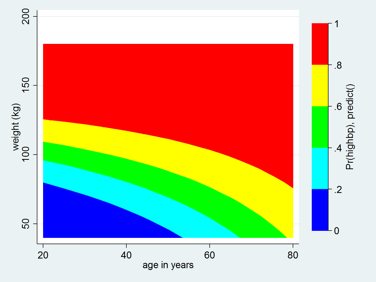
I like this graph, but I would like to customize it. For example, I use ccuts(0(0.1)1.0) to view the predicted probability of hypertension in increments of 0.1. I also relabel the axes and add titles.
. twoway  (contour pr_highbp weight age, ccuts(0(0.1)1.0)),
          xlabel(20(10)80)
          ylabel(40(20)180, angle(horizontal))
          xtitle("Age (years)")
          ytitle("Weight (kg)")
          ztitle("Predicted probability of hypertension")
          title("Predicted probability of hypertension by age and weight")
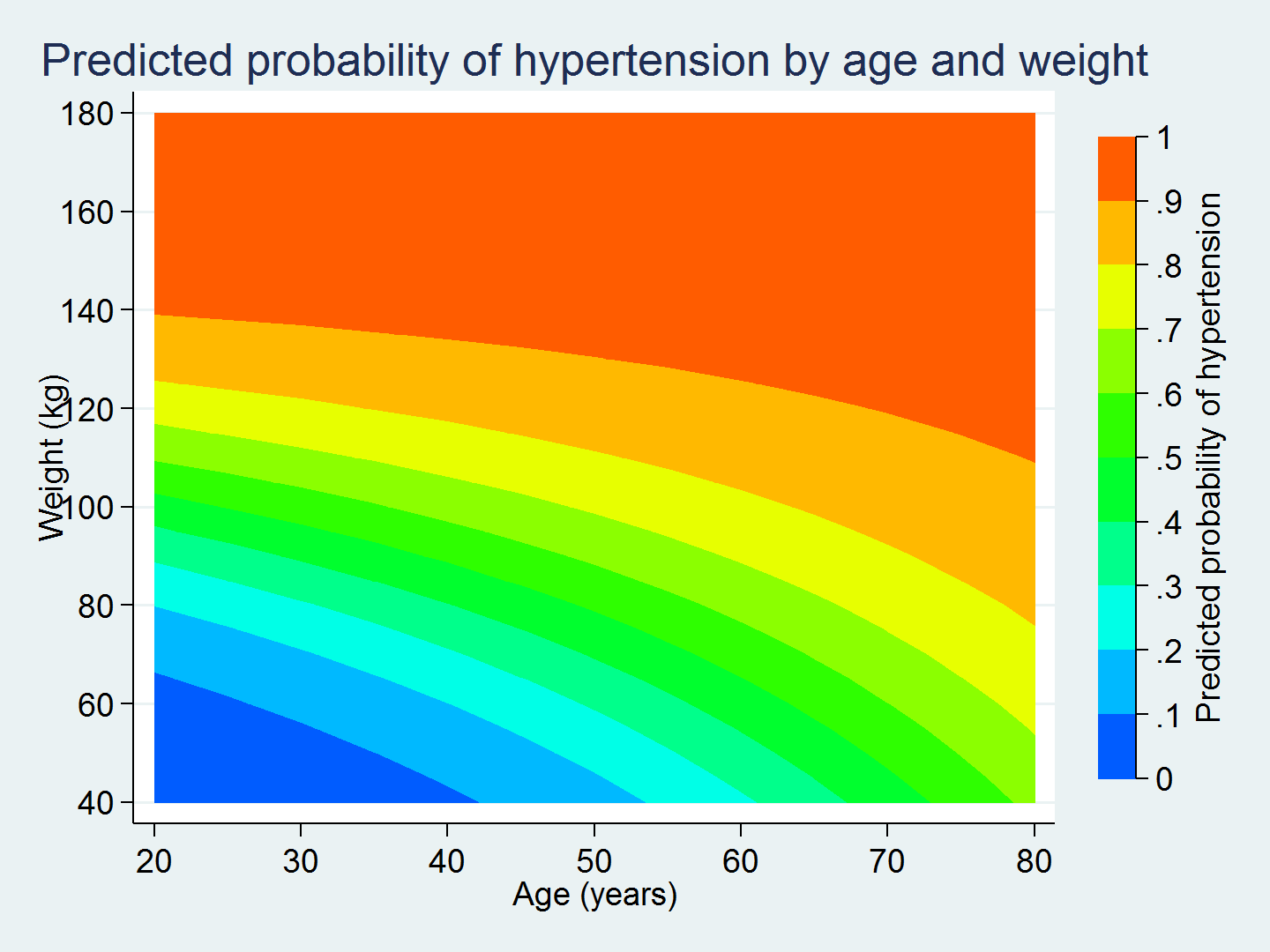
This graph is much easier to interpret than the odds ratio for the interaction term c.age#c.weight.
The graph shows us that a 30-year-old who weighs 80 kilograms has a 30% chance of having hypertension, while a 30-year-old who weighs 100 kilograms has a 50–60% chance of having hypertension. Knowing a person's age alone does not give us enough information to predict their probability of having hypertension. We also need to know their weight.
Similarly, the graph shows us that a person who weighs 80 kilograms at 20 years of age has a 20% chance of having hypertension, while a person who weighs 80 kilograms at 60 years of age has a 60–70% chance of having hypertension. Knowing only a person's weight does not give us enough information to predict their probability of having hypertension. We also need to know their age.
The interaction term in our model causes the curvature of the contour lines in the graph. Without interaction, the contour lines would be straight. This curvature shows us how the effect of age on the predicted probability of hypertension differs across levels of weight and vice versa. margins and twoway contour make it easy to calculate and graph the predictions from the model. And the graph makes it easier to interpret the results.
— Chuck Huber
Senior Statistician
Note: This article was inspired by Bill Rising's talk at the 2011 Stata Users Group meeting in Chicago: Graphics tricks for models.


